— CASE STUDY —
Spectrum
Spectrum Re-Brand
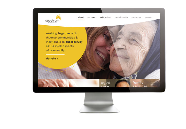
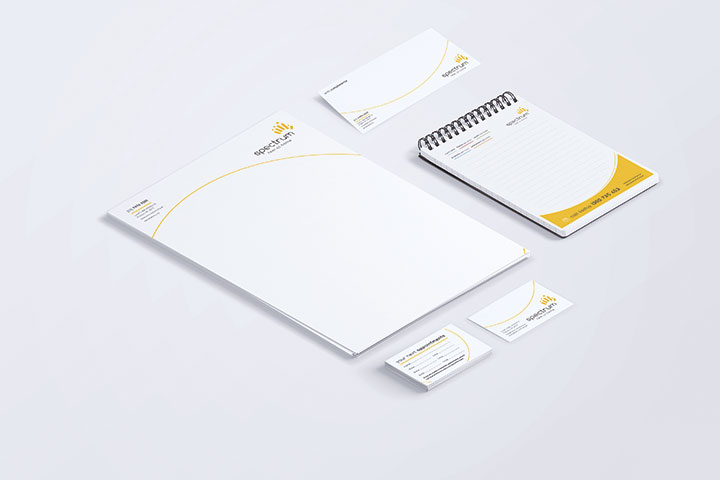
Identity design / Website design / Brochures / Stationery / Social Media banners / Report template / Annual Report / Invitations / Posters / Invoice templates / Video

Spectrum enable people with migrant and refugee backgrounds to feel at home in Australia.
Spectrum provides a unique service offering to multicultural clients. Their main services involve helping generations of culturally diverse communities and individuals reach their full potential in Australia and helping them to feel at home.

Brief
Spectrum needed to revamp their current branding to embody these values and raise their profile.
Approach
Our inspiration
To strengthen the relationships between Spectrum and their existing clients and reinforce the connection they share.
Diversity is essential to who Spectrum is. Embracing our differences.
Spectrum understands the migrant journey and are here to help and support them.
Helping generations of diverse communities and individuals reach their full potential in Australia and helping them to feel at home.
To give people a strong sense of belonging.
Spectrum speaks the client’s language and knows the intricate parts of their culture.
Listening to stories and learning from others experiences. Putting those who have lived these different experiences at the centre.
Using the inspiration above, Blick designed a new identity to encompass Spectrum’s values.
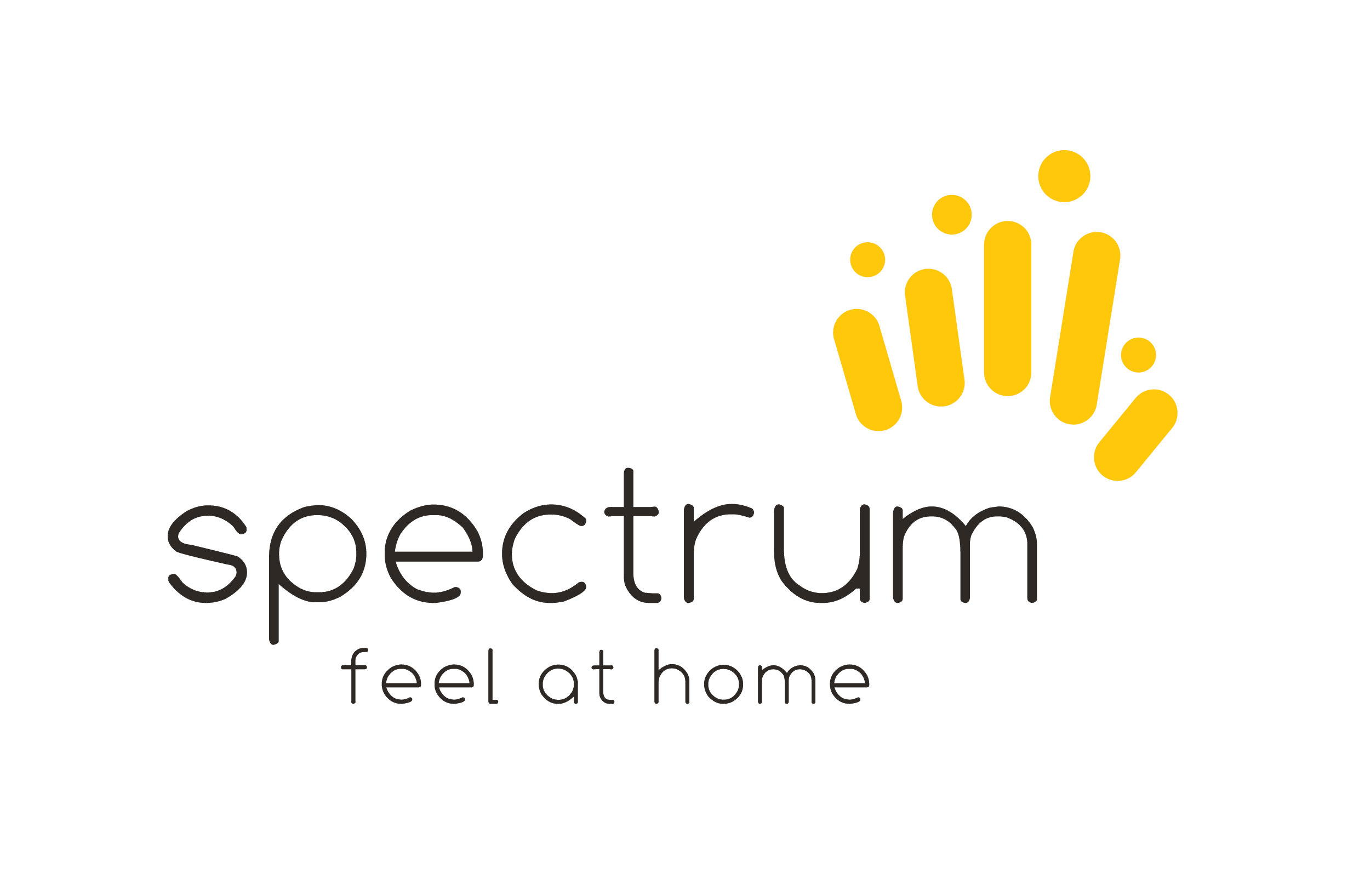
All men, women, children of various ages, abilities and ethnicities are the clear focus of the logo design. The varied line heights and shapes that form the icon show a sense of belonging in a fresh and contemporary way.
The helping hand that Spectrum has provided to so many in need is strongly referenced. We explored the theme of striving for excellence with a forward reaching icon; highlighting that this theme is an essential part of Spectrum’s programs and services from both a client and carer perspective.
Further to the coloured icon that positions Spectrum as a personable and authentic brand, the negative space in-between the shapes represents the inclusive nature of Spectrum. We felt it so important to show that there is room for everyone and that Spectrum works with people at all stages of life. We also designed the icon to loosely identify with the map of Australia, a destination where so many CALD individuals and communities feel at home.
This also touches on Spectrums ‘think global, act local’ approach, to create a sense of belonging between different cultural backgrounds.
The ‘creating tomorrow’ theme is presented in the bright, optimistic choice of colour and shape arrangement, to almost resemble a sunset and the start of a new day. We felt it important to show how Spectrum is creating a better tomorrow for the greater community.
The use of a rounded font and style of icon is friendly and professional. It works well as a mono (single colour) and in full colour. The proportions will see it work on large collateral at a distance, as well as quite small when needed, perhaps in a co-branding or sponsorship capacity.
Result
The presented logo helps existing and potential clients visualise their journey with Spectrum and experience an emotional connection with the brand; one that offers a ‘helping hand’ to generations of diverse communities and individuals, making them feel at home in Australia.
Our focus was to create a logo that is unique and identifiable – one that has a unique presence without being overbearing. The final outcome is an organic shape that is welcoming and approachable. It’s not over complicated and the simplicity of the logo is designed to leave an ongoing impression with the viewer.
The logo and full suite of collateral that we designed was well received by Spectrum and is now proudly used across all of their external and internal communications.


